# Button
按钮用于开始一个即时操作。
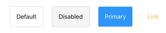
# 基本用法
import {Button, ButtonType} from "react-native-maui";

<Button
  style={{ marginHorizontal: 10 }}
  onPress={() => {}}
>
  <Text>Default</Text>
</Button>
<Button
  style={{ marginHorizontal: 10 }}
  onPress={() => {}}
  disabled type={ButtonType.Disabled}
>
  <Text>Disabled</Text>
</Button>
<Button
  style={{ marginHorizontal: 10 }}
  onPress={() => {}}
  type={ButtonType.Primary}
>
  <Text style={{ color: 'white' }}>Primary</Text>
</Button>
<Button
  style={{ marginHorizontal: 10 }}
  onPress={() => {}}
  type={ButtonType.Link}
  textStyle={{ color: '#fcb70a' }}
>
  Link
</Button>
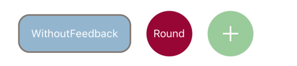
# 自定义样式
import {Button, ButtonType} from "react-native-maui";

<Button
  onPress={() => {}}
  style={{
    borderRadius: 15,
    borderWidth: 2,
    borderColor: '#80766e',
    backgroundColor: '#93b5cf',
    marginHorizontal: 10
  }}
  withoutFeedback
>
  <Text style={{ color: 'white' }}>WithoutFeedback</Text>
</Button>
<Button
  onPress={() => {}}
  type={ButtonType.None}
  style={{
    width: 60,
    height: 60,
    borderRadius: 30,
    backgroundColor: '#990033',
    justifyContent: 'center',
    alignItems: 'center',
    marginHorizontal: 10
  }}
>
  <Text style={{ color: 'white' }}>Round</Text>
</Button>
<Button
  onPress={() => {}}
  type={ButtonType.None}
  style={{
    width: 60,
    height: 60,
    borderRadius: 30,
    backgroundColor: '#99CC99',
    justifyContent: 'center',
    alignItems: 'center',
    marginHorizontal: 10
  }}
>
  <Plus />
</Button>
# 等待视图

import {Button, ButtonType, Loading, CircleLoading} from "react-native-maui";

<Button
  onPress={() => {}}
  type={ButtonType.None}
  style={{
    width: 100,
    height: 60,
    borderRadius: 30,
    backgroundColor: '#2593FC',
    justifyContent: 'center',
    alignItems: 'center',
    marginHorizontal: 10
  }}
>
  <Loading color="white" />
</Button>
<Button
  disabled
  onPress={() => {}}
  type={ButtonType.None}
  style={{
    width: 60,
    height: 60,
    backgroundColor: '#6666CC',
    justifyContent: 'center',
    alignItems: 'center',
    marginHorizontal: 10
  }}
>
  <CircleLoading color="white" size={20} />
</Button>
# 属性
| 名称 | 描述 | 类型 | 默认值 |
|---|---|---|---|
| onPress Required | 点击事件 | Function | - |
| type | 内置的按钮类型, 如果需要完全的自己定制请传入ButtonType.None, 并在style中设置样式。 | ButtonType <Default、Primary、Link、Disabled、None> | Default |
| style | 自定义样式 | ViewStyle | - |
| textStyle | 按钮支持直接把字符串当作子组件,设置本参数直接为该字符串设置样式。 | TextStyle | - |
| disabled | 是否可点击 | boolean | false |
| withoutFeedback | 点击是否有反馈 | boolean | false |
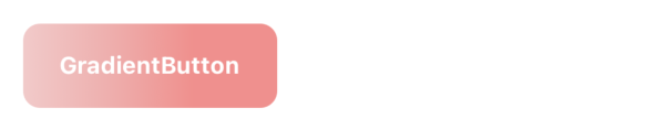
# 渐变
import {GradientButton} from "react-native-maui";

<GradientButton
  colors={['#f2cac9', '#efafad', '#f1908c']}
  width={150}
  height={50}
  onPress={() => {}}
  borderRadius={10}
>
  <Text style={{ color: 'white', fontWeight: 'bold' }}>GradientButton</Text>
</GradientButton>
# 渐变按钮属性
GradientButton组件的渐变效果是由react-native-svg实现,所以需要显式地提供宽高来绘制矩形。
| 名称 | 描述 | 类型 | 默认值 |
|---|---|---|---|
| colors Required | 渐变颜色数组 | string[] | - |
| width Required | 按钮宽度 | number | - |
| height Required | 按钮高度 | number | - |
| borderRadius | 圆角 | number | - |
| borderWidth | 边框宽度 | number | - |
| borderColor | 边框颜色 | string | - |
| style | 按钮样式 | ViewStyle | - |
| start | 渐变起点坐标 | { x: number, y: number } | { x: 0, y: 0 } |
| end | 渐变终点坐标 | { x: number, y: number } | { x: 1, y: 0 } |