# Progress
进度条。
# 条形进度条-基本用法

import { Progress } from 'react-native-maui';

<Progress
  style={{ marginVertical: 10 }}
  height={15}
  width={200}
  radius
  value={10}
/>
<Progress
  style={{ marginVertical: 10 }}
  activeColor={"#1781b5"}
  inactiveColor={"#63bbd0"}
  height={15}
  width={340}
  value={78}
/>
# 条形进度条-渐变

import { Progress } from 'react-native-maui';

<Progress
  width={180}
  height={20}
  style={{ marginVertical: 10 }}
  value={60}
  activeColor={['#eea6b7', '#e9ccd3']}
  inactiveColor='#F8F8F8'
  radius
/>
# 条形进度条-动画

import { Progress } from 'react-native-maui';

<Progress
  delay={3000}
  duration={3000}
  width={300}
  height={15}
  style={{ marginVertical: 10 }}
  value={10}
  toValue={90}
  radius
/>
# 条形进度条-属性
| 名称 | 描述 | 类型 | 默认值 |
|---|---|---|---|
| value Required | 进度条显示的百分比。 | number(0-100) | - |
| width Required | 进度条宽度 | number | - |
| height Required | 进度条高度 | number | - |
| toValue | 动画必需,进度条最终到达的百分比 | number(0-100) | - |
| activeColor | 已展示进度的颜色,如果需要渐变效果请传入多种颜色数组。 | string or string[] | #1e90ff |
| inactiveColor | 未展示进度的颜色 | string | #D8D8D8 |
| radius | 是否展示圆角 | boolean | false |
| style | 进度条容器样式 | ViewStyle | - |
| delay | 动画延迟执行,单位ms。 | number | 1000 |
| duration | 动画执行持续时间,单位ms。 | number | 1000 |
| onChangeValue | 每次动画执行的回调,参数是当前动画指定到的百分比数值。 | Function | - |
# 圆形进度条-基本用法

import { CircleProgress } from 'react-native-maui';

<CircleProgress
  size={60}
  value={75}
  renderCenter={(percent: number) => (
    <Text style={{ fontWeight: "bold", fontSize: 25 }}>
      {percent}%
    </Text>
  )}
/>
<CircleProgress
  size={75}
  value={30}
  activeColor="#c6dfc8"
  inactiveColor="white"
/>
# 圆形进度条-渐变

import { CircleProgress } from 'react-native-maui';

<CircleProgress
  size={60}
  value={100}
  activeColor={["#f7da94", "#f9d27d", "#fbb929"]}
  renderCenter={(percent: number) => (
    <Text style={{ fontWeight: "bold", fontSize: 25, color: "#fbb929" }}>
      {percent}%
    </Text>
  )}
/>
# 圆形进度条-动画
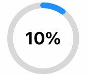
import { CircleProgress } from 'react-native-maui';

<CircleProgress
  delay={3000}
  duration={3000}
  style={{ marginVertical: 10 }}
  width={15}
  value={10}
  toValue={90}
  renderCenter={(percent: number) => (
    <Text style={{ fontWeight: "bold", fontSize: 45 }}>
      {percent}%
    </Text>
  )}
/>
# 圆形进度条-属性
| 名称 | 描述 | 类型 | 默认值 |
|---|---|---|---|
| value Required | 进度条显示的百分比。 | number(0-100) | - |
| toValue | 动画必需,进度条最终到达的百分比 | number(0-100) | - |
| activeColor | 已展示进度的颜色,如果需要渐变效果请传入多种颜色数组。 | string or string[] | #1e90ff |
| inactiveColor | 未展示进度的颜色 | string | #D8D8D8 |
| style | 进度条容器样式 | ViewStyle | - |
| size | 圆形进度条大小 | number | 100 |
| width | 进度条宽度 | number | - |
| delay | 动画延迟执行,单位ms。 | number | 1000 |
| duration | 动画执行持续时间,单位ms。 | number | 1000 |
| onChangeValue | 每次动画执行的回调,参数是当前动画指定到的百分比数值。 | Function | - |
| renderCenter | 圆形进度条中间View渲染函数,参数是当前动画指定到的百分比数值 | Function | - |