# ListRow
列表展示。
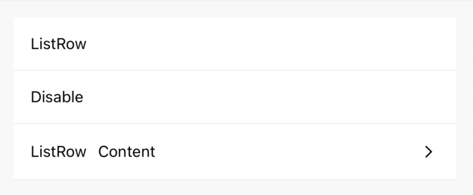
# 基本用法
import {ListRow, Icon} from 'react-native-maui';

<ListRow left="ListRow" />
<ListRow left="Disable" disabled={true} />
<ListRow
  left={<Text>ListRow</Text>}
  mid={<Text style={{ marginLeft: 10 }}>Content</Text>}
  right={(<Arrow />)}
/>
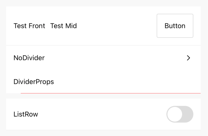
# 自定义属性
import {Button, ListRow, Switch, Icon} from 'react-native-maui';

<ListRow
  left={<Text>Test Front</Text>}
  mid={<Text style={{ marginLeft: 10 }}>Test Mid</Text>}
  right={
    <Button onPress={() => {}}>
      <Text>Button</Text>
    </Button>
  }
/>
<ListRow left="NoDivider" divider={false} right={(<Icon name='arrow-right' />)} />
<ListRow
  left="DividerProps"
  dividerProps={{
    start: 30,
    end: width,
    color: 'red'
  }}
 />
<ListRow left="ListRow" style={{ marginTop: 10 }} right={(<Switch />)} />
# 属性
| 名称 | 描述 | 类型 | 默认值 |
|---|---|---|---|
| left Required | 左侧显示内容 | string 、 React.ReactNode 、 null | - |
| mid | 中间显示内容 | string 、 React.ReactNode 、 null | - |
| right | 右侧显示内容 | string 、 React.ReactNode 、 null | - |
| disabled | 禁止点击 | boolean | false |
| onPress | 点击事件 | Function | - |
| style | 容器样式 | ViewStyle | - |
| divider | 是否显示分割线 | boolean | true |
| dividerProps | 分割线样式及属性 | DividerProps | - |